Thursday, 9 May 2013

Exam Unit - Exam Evaluation


When I first started this project I wanted to take beautiful natural portraits of women inspired by the 'marilyn monroe' shoot. By the progression of the project I wanted to be more experimental and try different things. I then decided that I wanted to take more dynamic shots, maybe becoming disturbing. I now wanted to photograph people that symbolise their state of mind or telling a story. This relates to the exam theme as I wanted to photograph what people had inside their head, showed on the outside. 

When I first started doing my research I an artist called 'Eve Arnolds'. Images like she took was now then image I wanted to take. I then grew an interest in other images and found an artist on pinterest called ''Inflarenzo Latif''. This artist looked at how people reacted to their environment. This had to be the turning point in the project and changed my whole way of thinking about how I wanted to excite the final piece. He was my main influence. 

Using different experiments digitally and handmade in the darkroom I decided that simplicity was best. By over saturated my images on photoshop really brought out the colours and made my images more in your face, raunchy and inviting which is what I wanted to achieve. I then decided to make reversals in the darkroom as I thought this negative effect would add to the effect of edgy, dark and mysterious. I found that by doing the more complex experiments such has combination printing, photo batik, double exposures and handmade negatives, the simpler techniques were better for me. 


Overall I like the exam theme as it changed my way of thinking about photography. I learnt different techniques and researched more diverse and modern photographers that have inspired me in the future. I really enjoyed going out and taking these photographs and editing them to really enhance the colours. Overall I think that I will be really pleased with the outcome of my final exam.

Monday, 29 April 2013

Exam Unit - Presentation Experiments.

wine glass. first attempt at experimentation outcomes. 

turned other to the other side. 


By looking at Tracey Emin art work of ''My Bed''. This is given me inspiration of my presentation idea. By using Inzajeano Latif same technique of how people interaction with their environment, I want to also combine Emin's technique also. My photographs involving females being rebellious and presenting the bad lifestyle; drinking,smoking and being provocative. Then tearing up the images and placing other relevant objects to the theme. I then want to use Tracey Emin's technique of creating a dirty, grotty installation of the collaged photographed images and place them in a way to be rephotographed into a still life. I really like this idea and this will work really well combining the two techniques. I think that this will really be an appropriate and interesting of presenting my photographs making it relevant but also making it visually interesting and attractive at the same time.


Exam Project - Indepth Analysis - Tracey Emin

''My Bed'' - 1998 


Tracey Emin is a British artist from croydon, born 3rd July 1963. She is also a part of Young British Artists. She uses her own life events as inspiration for her work. She studied at Maidstone College of Art and the Royal College of Art, London. Later that year, she was a Turner Prize nominee and exhibited ''My Bed'' - an installation, consisting of her own unmade dirty bed with used condoms and blood-stained underwear. She has exhibited extensively internationally including solo and group exhibitions in Holland, Germany, Japan, Australia and America. I think that this work relates to life issue like social and cultural society like students. I think the meaning is immediately obvious to you of the dirty, grotty scene. For the object in the photograph, you can tell the events that went on inside the bed.

The photograph has been framed where the bed in central, this enforces that this is the main focus of the image, the composition makes the image more dramatic and ''in your face''. Her composition of the objects inside the image are very important and really impact the end result. I think that the objects were designed in a way to look like they were randomly placed there but in actual fact the artist has placed them there. She wanted it look messy and grotty and I think that she has done this effectively. Overall I think the arrangement of the objects is really relevant to the theme and has really captured the essence of the real atmosphere but the story of the artists life before this.

I think this photograph was planned before hand. I think that all the object were placed carefully in a way they would be photographed in the best way. This is an installation so I think there was no photo editing atall done to this and was probably taken on a basic camera. No work was done on Photoshop.

I think that this work is really dramatic but I find that there is something really relevant about it. I think that this a probably realistic image of most students/young people bedrooms. I think that this artwork could also symbolise mind state, wondering what the person was thinking at the time, what were they going through to have the crazy rebellious lifestyle at that point, was there other things going on? I really like this image as it makes me want to know more about the person and whats going on in there life?I think that the artist was trying to put across that something so dirty could actually visually interesting. Words that describe about this work would be; interested, confused, curious and suspicious.


Friday, 26 April 2013

Exam Unit - Final Digital Images.

Really high brightness/contrast, then turned into black and white.
Wanted to make the image look very intimate. the angle of the image could be better
as the models face looks a bit awkward. Framing could be better. 

Enhanced the brightness/contrast. Really like the framing on this image.
This has to be my favourite images of all the images that I have taken.
I found that putting the image in black and white made it look really sensual which
is how I wanted to really symbolise. 

The brightness/contrast onto 100%, I have also over exposed the image.
I think that by doing this, it really makes her bold by dramatic colouring
makes me want to look at her more. I found this an interesting angle and
it looks like a behind the scene shot. 

Again with this photograph I have over saturated the image
and turned the brightness/contrast up. This really enhanced the colours.
I think the positioning of her face could be better. But overall I am pretty pleased
with this image. 

The framing could be better. Altered the brightness/contrast and also used the
posterize effect. I felt like this work really well. 

This close up shot of the models face I find really worked effectively.
I put the brightness/contrast up and turned the image black and white and
then over exposed the image. I find that this worked really well and is a nice image of
the models face. 

I find that this close up of the model worked really well. Her pose really
relates well with the theme. By altering the colours highlighted all the key areas I wanted
to and made her look more rebellious. 
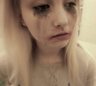
Here are some of my final digital images I am using to cover my images. These images I have used I wanted to symbolise a really sexual and rebellious theme and reflect promiscuity. I found with theme Images I have done this and very happy with themes outcomes. To push these further in the exam I have going to photocopy the images onto different textual paper and create reversals in the darkroom to really enhance them images more. 

Monday, 22 April 2013

Exam Unit - More Darkroom Prints & Experiments

Here are my inspired Latif images. I wanted to get images of people interacting with their environment.


I then went into the dark and made reversals of these images. I thought this would work as my images come out grey and I thought it would really bring out the highlights. The reversals were exposed on 8 aperture, 5 filter, 3,0 seconds 


Some of them worked well and others didn't as you can see, because there wasn't enough highlights and shadows I lost some detail in there, overall I think The reversal technique worked well and work with the theme of dark and distortion I'm working towards. 

Monday, 15 April 2013

Exam Project - Darkroom Prints

good use of lighting on her face, more contrast needed

good depth of field, good focus, too dark

good use of depth of field, too grey not enough contrast, need more focus

Too dark, good use of focus. 

good use of depth of field, needs more contrast,

 All darkroom prints were the same settings 3,5 seconds, 5,0 filter on 11,0 aperture. As you can see from the prints that as they've gone through the scanner that marks have appeared. I found with these images I would have liked them to be most contrasting as I find them to be quite grey. I wanted my images to reflect emotion, depression, distortion and distressed. I wanted the image to be real. I felt that this has come across in these images.


Exam Unit - Exam Review


The two starting points that I chose were 'Everyday Life' and 'Inner Character'. I wanted to look at being figurative as I had seen this in the past and was really interesting in this. I also like the dressed up classic poses such as 'Marylin Monroe'. I started to look through pinterest at other examples of these. I found many I wanted to recreate myself. Concentrating on extreme artificial lighting and soft focus. I also came across other work I was interesting that tied in with both starting points. I found an artist who took natural shots of people in their environment. These were quite urban areas displaying the people who live there and there emotion towards it. 

At first my idea was set on doing an inspired marylin monroe shot being very pretty and precise. When I started looking at other work I started to get interested in the images that were accidently taken or don't looked so designed. I wanted to use the same technique that inflazeno latif did, but try and reflect what the person is thinking in the picture and try create different effects like trying to show sadness, depression, excitement, worry, etc. By trying this myself using a digital camera, I really like the effects and the feedback from my classmate at looking at something more complex and having to think. I really like that my audience may be thinking what happened to my model before this image, what were they thinking at the time, what happened to them, what's there story? These thought provoking question makes the series of images exciting. 


With negatives that didn't work properly I decided to take them and experiment with them. I use may technique I have used before such as multi exsposure, photo batik, handmade negatives, solarisation. I wanted to take these a step further and layer them up and see what would happen. I particualry like my image with multi exspoure as I like the distorted effect i gives which goes well with my theme. A technique that doesn't really work for me is using food colouring. I find that when it doesn't dry really well on the prints and gives it streaks and can become quite blotchy. I wont progress with this technique as I don't like the results of this.

I really want to develop the combination printing, I've tried a little bit but it is hard to get the prints exact matching and not make the print com up black in some parts. I need to practice this and develop it further. I really want to concentrate on filters and produce really high contrast photographs which is what is preferred to me. 

I have really been influenced by inzajeano latif, his realistic approach to photographing people and their environment, I have taken on board myself the same attitude in taking my photographs.

My exam plan for the next two weeks is research different ways of presentation, I really want to visually excite people with my work so need to research other people who i think does this. I also need to carry on experimenting - seeing what works, what doesn't, how to enhance the images best I can. Then start during up mini exam outcomes. Maybe time myself? Also figure a plan of what I actually want to achieve whilst in the exam.

Friday, 29 March 2013

Exam Project - Digital Experiments

Looking at the starting point of inner character I decided to take these digital images to try and create an emotion. I tried to use artificial lighting to create some nice highlights and shadows. Here are my orginals before edited. 


Then I started edited them to really try and enhance my images as much as possible. I used a photo editing site to create the effects.
Use duo tone effect of two different tones of pink. I like using two of the same colour and the fact that some of image you cant really see any more. Maybe need to have some more shadows to pick up more detail. I decided to use this effect as I have never done it before. Completely changing the colour makes it quite interesting.


This is called 'grunge effect'. I really like this effect as I think that it really adds to the distressed mood I wanted to create. I think it really gives it dark mood. 

For this image I used high contrast and high sharpness to really capture all the detail. I really like this edit as it has captured all the detail the camera and lighting didn't really catch. It really enhanced all the colours.  


Brightness and contrast has been taken up. Just really clean I think that the soft focus really compliments the lighting and work very well together. 

I have de saturated the colour I little bit, I felt this impacted the emotion. I have also used the edit focal zoom. This has created some depth of field. The zoom adds to the image and she looks lost and fade out of the image make her centre image. 

I have used the pixel effect, you get to choose where about you want it. I also used high contrast. to really enhance the colours.

I have played around with the levels, brightness and contrast,. I really wanted to highlight ever, If needed I would crop as I really don't like the composition of these images now. 


I really like these image and felt I have perused what I wanted todo. I used artist Latif's ideas and developed them further into my own. I wanted to take images of reflective emotion. Not image has to be clean and planned and pretty, sometimes realistic raw image can be visually interesting too.