Sunday 30 September 2012

Enhanced Image Project - Dodging and Burning

For today's lesson we were introduced to improving our prints with a technique called dodging and burning.
This effect is where you expose different light setting to different areas of your prints to either lightening or darken areas.
8 seconds, as you can see a little under exposed sky 

9,0 seconds but the building is far too dark 

dodging and burning attempt 1; used an old print of the same negative and cut out the pieces ,e.g the sky and the building. First I covered the building and exposed the sky for 9 seconds and then covered the sky and exsposed the paper to 5 seconds

here the same settings but I think when i exposed the building I turned the aperture down which gave it this under exposed ghostly effect.

with the previous prints, I just placed the old print of top but as you can I was using two pieces, you can see where the paper laid, so for this one i just hovered the paper above as the light was exposed. But as you can see again there a shadow effect above the buildings. 

Enhanced Image Project - Darkroom Prints.


 First of all I created test strips to refresh my skills in the dark room. I also created test strips for my prints to find out the right timings and settings.
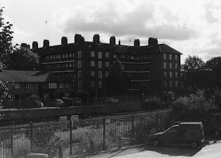
This image is of the power station across the road from my house.
Using aperture setting of 11 and filter 5,0 left on for 7 seconds I got this result

I then experimented with a print of exposing it to the light and the painting on the developer.
Another technique of highlighting area's. 

Again here I used a coin to place on my photographic paper when exposed  to the light.
what i didn't do was exspose the whole image at first for half the exposure time, then place the coin over the top.
Therefore mine is blank rather than a highlight.


This one I wanted the vignette effect. For this I got a piece of black card and cut out a oval shape,
after this was done I adjusted my lighting setting and whilst exposing to the light you hover the card over you paper to get a soft edge effect

Monday 17 September 2012

Enhanced Image Project - Digital Manipulation - Nashville Effect.

original image 

finished edit


To create the nashville effect I followed simple steps of a tutorial. The tutorial is meant to be similar to the nashville filter on Instagram, I like this edit as it gives a vintage look. In the future I will experiment more using this effect.

Enhanced Image: Digital Manipulation - Vignette Effect.

original image

edited image

Open your image up into Photoshop, click filter>lens correction>custom tab
select the vignette bar and adjust to whatever setting you want it.


Enhancement Project - A2 - Nina Chakrabarti

faces_colour
This image was made by an artist called Nina Chakrabarti under a selection of images called ''Magazines Doodles''. Nina originally came from India, but later moved to London to study illustration. She still lives in London.  She likes to combine her art with objects. I have chosen to analyse this piece as it has taken a piece of work and created a layer and built up onto it a made it more visually attractive. It is also different from the usual artist that I look at.

Chakrabarti also illustrated books such as '' Penelopaid - Margaret Atwood ''. I would associate this art work with contemporary photography as it a quite modern approach going over work and adding to it. The theme of this image could be colour due to the colours used. The title of the work was called ''Magazine Doodles'', from the title says a lot. It could imply quick experiments the artist has created. It could also be todo with on the front of the magazine the word ''BEAUTY'' is placed in bright bold white at the top of the title. The artist has then go on over the model face, the could be her way of expressing her interpretation of beauty.


From the image shown it looks like the artist has used magazines papers along with ink and has then gone along and scanned in her work and edited it over Photoshop.This artist uses bright bold colours like pinks, purples and blues which makes it visually exciting and attractive.  I can imagine the image being A4 size of the magazine. The lines are very free and flowing and give the image a sense of movement. The pattern of flowing lines makes it look as though the lines are growing. With the colours and lines used makes the image looks free and light. I enjoyed looking at these images.

I have chosen to look at this work as it was one of the artist I have glad briefly looked at before and wanted to revert away from black and white images and this artist work drew to me the most. My first reaction to the work was that it was bright. I also liked the detailed pattern. The piece reminds me of when you're bored and you start doodling but a much more well presented piece of art. I haven't seen any other artist like Chakrabarti work as she has a unique way of working. This work has inspired me to more with Photoshop and experiment with layering work.


Sunday 16 September 2012

Enhanced Image A2 Indepth Analyis - Dan Mountford

Image of Hideaway Hands


This image is called ''Hideaway Hands'' by Dan Mountford. Mountford is 21 yea old student living in brighton. He works in photography, illustration and editorial & motion design. This is a double exposure photograph.His work has been exhibited in Solo Show, Gallerie Florence Leoni, 10th DEC - 17TH DEC 2011, Paris, FR. I have chosen to analyse this artist as his work is similar to other artist I have researched. 

Other students have researched this artist and have found out more information. After exposure, Mountford later edits his images with either Photoshop or Adobe Illustrator. The theme of this artist work is double exposure's. The image could tell you a story about the person in it. This looks like that the person maybe insecure, or an event has happened prior to this. Only being shown a small section makes it more visually interesting and gives it another layer of meaning.

The double exposure technique has been used where you placed two negatives on top of one another into the negative carrier and expose the light onto the photographic paper. You then use the relevant photographic process to process the image. Black and white colour was used for this image which are my favourite kind of images. For this one in particular, the image inside the hand is quite dark and draws us into the light parts which are the eyes. This makes it the center point. The composition has been thought out and make it look as though the person behind is traps and the hand is reaching out could be contrasting ideas. Bringing in the composition and the use of colour has produced and intriguing dark image that could say many things.

I have chosen to look at this artist as I was researching another artist Mountford was compared to him. This made me intrested in seeing his work as if they were compared I would like his work. I have enjoyed looking at this artist work as they may have double meanings and not necessarily obvious first looking. I enjoying looking at images that made you think about them and questioning on how they make you feel. My first reaction to the work was insecurities, but as I looked at the image more I began to think of more scenario that it could be. Mountford work reminds me of Florian Imgrund as they use the same technique of multi-exposure, which are one of the technique I like. These artist have inspired to carry on improving my technique of double exposure.

Enhanced Image A2 Indepth Analysis -Florian Imgrund


This particular piece of artwork was created by an artist called Florian Imgrund. This image was created with an analog camera. Florian first brought his camera in 2012 and since then his passion for photography has grown. On his website, he has a small selection  of images. All of his images are taken on a film camera and then self developed with no computer manipulation. This image has had double exposure, when you place two negative on top of one another and exposed them onto the photographic paper. I have chosen this specific photographer out of the rest of them is because of his technique, I have tried this myself and enjoyed the result and would like to continue experimenting in the future. 

The artist hasn't given his images any names or captions so I couldn't retrieve that kind of information. Christopher said; '' I don’t think I've been this impressed with double exposure work since first discovering Dan Mountford.'' This image has a deeper meaning representing life. From the readings, Florian gained inspiration just purchasing a camera and has been shooting ever since. All his images have the same theme of double exposure of combining images of people and of nature creating interesting results that can be quite powerful and thought provoking. 

Materials used were an analog film camera, then later self developed in a darkroom with an enlarger and the relevant chemicals with computer manipulation. As already said, his technique is double exposure. The process involved is after the film is processed you put two negative on top of one another and place them in the negative carrier, you then experiment and produce the right lighting times and then go through the step by step chemicals; developer, stop and fix and come up with these results. For this particular artist his images are black and white. I think this produces and strong bold emotion tied with the image itself to produce a striking result. Imgrund has specific thought about composition and which works better to complement the two images. 

When I look at this image, it makes me think of a wide range of opportunities. The person in the image having his arms open to the world represents dreams and hope. That anything is possible and whatever you want to do you should go for it. It also makes me think of freedom. My reaction to the work was the colour - my personal preference I prefer black and white images. It was also the technique because I've used the same technique before as well. It is good to have done something yourself before as I think this makes you understand the process more yourself. I have enjoyed looking through this artist work and it has inspired me to do more of these image using the same technique and will help me to improve and be able to create similar images to these.

florian imgrund - link to artist website