Friday 13 July 2012

Abigail Reynolds work

Abigail Reynolds work

This is my interpretation of Abigail's work 
Abigail Reynolds lives and works in Cornwall, Her work consist cutting into and image to shown another than has been put underneath. Here are some examples..


I used to contrasting images of the weather as I thought this would work well. I then selected my top image and glued a piece of sugar paper to the back of it. I then started designing a grid of the front of my image. Once I had done this I started cutting out some lines randomly. Once I had done all the shapes I wanted to I placed my second image underneath. This was my result.

I really enjoyed making this image as it was very fiddly to do. If I had more time I would have experimented with some more. 
Geraldine Georges is a young Belgian illustrator/graphic designer uses a wonderful and sophisticated blend of illustration and photography. 
Her work is often abstract of the female form, captures the eye and imagination. Influences of fashion and couture flow throught her wonderful pieces. - http://www.indiesart.com/artist/225-geraldine-georges


examples of the artists work


my interpretation
To create this image you first selected the original image, I got a image of tree from Google and opened it into Photoshop. I then resized and placed it where I wanted it to be. I then used the lasso tool on Photoshop and drew around my image not being too neat. You then need to hold ctrl and the mouse the inverse it, press delete then deselect it. You can then go around your image using the eraser tool to create some kind of effect. You next create a new layer. Select the shape tool and select eclipse and put the shape where you would like it. Put this layer underneath the original one and fill the shape black. You then need to add on another additional layer and click on the brushes tool, select any type of brush you want, be experimental with it.

My interpretation isn't the same as Georges as I wanted to make it a little bit different. I like the artist work as it is different and creative and there prep e.g. the Photoshop work before the end result. If I had more time I would like to have created more and improve and get my interpretations more like the originals. Overall, I enjoyed creating these images. 


Norm Magnusson


I strive to create art that is both beautiful and meaningful, art that is aesthetically and intellectually accessible and deals with important themes. This current body of work is on a theme that has informed a great deal of my work over the past couple of decades -- mankind’s complicated and vast relationship with nature.This current body of work is on a theme that has informed a great deal of my work over the past couple of decades -- mankind’s complicated and vast relationship with nature. - From Magnusson Blog


Artist examples


My experiments


At first we was able to chosen what we wanted to decorate. I choose a big leaf and a pine cone. We then chose the colour paint that we wanted. I wanted to be random for the leaf and be experimental. With the pine cone I just done a variation of the same colour gradually getting lighter in three parts. After we had done all the decorating and let them dry we went outside and placed them where we wanted them. These are my results.
Jan Van Holleben was born in 1977 and was raised in Southern Germany. He was inspired by his father and followed his photographic career. He got his first camera when he was 13. He later moved to London, got a degree and set up 2 Photography collectives. He worked and had exhibited internationally.

examples of Holleben's work 

examples of Holleben's work 

Recreation of Holleben's work

Recreation of Holleben's work 

I really enjoyed doing this task as it required us being creative and experimental. I would really like to do this again.
First we created the scene on the floor using a variety of materials, card, cotton wool etc. We then placed the person in the scene and made sure everything was positioned correctly. We then went to a place which was above (the top floor of my college) and took pictures!

This is a copy of Lin Osborn work. 

This is my recreation of it. I have used my own images and cropped them down into Photoshop and being selective of which parts I wanted of the image. I then dragged and dropped then into another document I made at A4 size and placed them in a symmetrical order making sure all boxes were the same size. I enjoyed doing this tutorial as I feeling it was very loose in what you had to do and you could be free and creative with it. I definitely think I would do more images similar to the way Lin Osborn has done it. 

Typography Photograph 


I created this image using Photoshop and my original picture in. I then separated them using layers ''Midtones'' and ''Shadows''. Then used a plain white background to fill the gaps. Once this was done I merged the two layers together and made another new one to create my brush. 

On a new page, I selected the text I wanted and typed the text I wanted. Once I had done that I went into edit, define brush preset and made the text a brush.


I went back to the original document and got my brush tool, the colour was on black and making sure this was the empty layer I painting the brush all over the page. After a couple of times I adjusted the size and repeated the same process until the page was covered. Click layer mask on text layer, hide layer, select layer 1, select all,  copy, show text layer, click on the layer mask (white square), paste your selection.


You then have to invert,hide layer 1, create new layer, drag it down so its underneath text layer and fill it white.Select text layer blending options blending mode on screen - choose gradient - edit scale and angle. Click on brush tool, soft brush size 30 opacity 30,paintbrush over certain layers to get rid of excess white.


My final result didn't very well and I think this lead onto the original image itself. This also is an image that doesn't relate to my theme but I plan to do more of these experiments with my own photographs. 
Cornwall, Looe Beach

Cornwall, Looe

Cornwall, Banjo Pier, Looe.

Cornwall, Looe Beach.

Taymar Bridge, Cornwall/Devon

Lavenderhill, Battersea 

Battersea Power Station

Battersea Park 

Battersea Park 

Battersea Park

Richmond Park 

Richmond Park 

View from the embankment, Vauxhall
AS-A2- My Experimentations.
These are images I have taken using my iPhone relating to my chosen theme Landscapes.Some were taken whilst I was on holiday in Cornwall. 
AS-A2 - My Chosen Genre 


this is an image that I have taken from google images by just typing in landscape photography.
I really like the composition of this photography and we have a great view of both the sea and the sky.
The colours give it a warm feeling and a calming mood. You can also see that some editing would have been done to enhance the colour even more. By the looks of this image it looks like the photography has gone along to the beach to capture the sun setting along with a great view of the bridge here. I like this image as it reminds me of a calming place we all go to at the end of the day and also looks like an image where you could put on canvas and place on your wall at home. 

I also really like this image as it is of my hometown London. Again, this image was taken from google images under the title Landscape photography. I particularly really like this image as it is taken from really far away but you can see in the distance the city line along with the sun about to rise. It reminds of different times - that London had gone to sleep and now we are going to wake up again.With the sun being so bright, that is my main focal point and all the dark colour around also help it be the centre point.

I really like this image due to the colours. As there are not that many and the very plain pastel colour gives the images a warm feeling. Gives a story of maybe a long journey and the person has now reached its destination which is in the background. Again, this is something I would like to have on my wall and it's really simplistic and not too busy which is photographs that I prefer. 

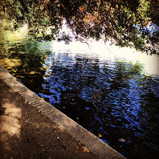
When I look at this image I think of religion. It looks as though the heavens have opened  onto the water. this could symbolise some sort of message is being given or it is a sign. This could also interpreted as opposite, almost like ying and yang. The dark navy colours and grey and black with the white shinning through the middle. This could be a beginning of a movie and a rainy setting. When I look at it I think of bad weather and storms and negative feelings. At the same time I like it because it gives you that feeling when it has been badly raining and that moment when it stops and the sun about to come through. 
My chosen genre is landscape as this has been my favourite genre to look at whilst researching the selected themes. I have think it would be a reasonably realistic to specialised myself in for A2 photography. 
Fashion Photography: This is an image I have taken from google images researching fashion photography. This image in particular drew my attention with the bright bold colours. I Like this image as it is unique and supports a wide range of colour. I also like the nice finish with the editing. This could inspire me to do this for myself at a later date.

Contemporary:  This is also an image I have taken from google images. I liked the dark colours which makes it look quite mysterious. This made it interesting for me. I particularly like images of nature anyway which made it even better. 

Landscape: Taken from google images. I have chosen this one because of the contrast in colours. I like that the grass is a bright green against grey dark clouds. Makes it more attractive to look at  with the opposite colours and moods.

Documentary: Taken from google images. Most of documentary photography are in black and white and I think this is because it adds more emotion to the images. This is a genre of Photography I would like to do in the future after college as I feel it is not realistic to do yet.  This image is very emotive. 

Figure Studies:  Taken from google images.  Image is also in black and white. The light is shone on one specific area leaving the rest black. This makes the audience eager to see more of the person and see everything that is going on. Therefore keeping the audience engaged. 

Architecture:  Taken from google images. 
With the photography taken from that angle you were able to see the whole tower. Making it black and white it has enhanced the towers features and made it look beautiful. Also the dark clouds around the tower makes it center point and more visually attractive.